Matrix
Overview
Certain organizations are organized in a complex way with units or dimensions structured not in a hierarchical way. A Matrix navigation has been built to help such a situation by introducing a Matrix of combinations of Dimensions or units. This will help the information architecture in a proper way. For example employees in an Australian location may not be interested in the content relevant to Europe or Germany. The Matrix navigation can serve the right content to those targeted users, depending on the selection of dimensions the information is served.
LiveTiles Intranet Hub provides the ability for administrators to construct more concise navigation based on the organisation's user needs. This feature is fully available to all customers.
We have three areas of this feature that comprise the matrix as a whole, the Matrix Editor, the Matrix Navigation and the Matrix Breadcrumb.
Note: This feature is only available on paid subscription types of Intranet Hub.
Enabling The Matrix
The core functionality of the Matrix is behind one feature toggle & the Matrix Breadcrumb is behind another. To enable the Matrix you must add an enabled flag to the features object in the Global Hub Config.
Note: The Matrix breadcrumb will override the Mega Menu breadcrumb if enabled.
"features": {
    ...
    "matrix": {
      "enabled": true,
      "breadcrumb": {
        "enabled": true
      }
    }
  }
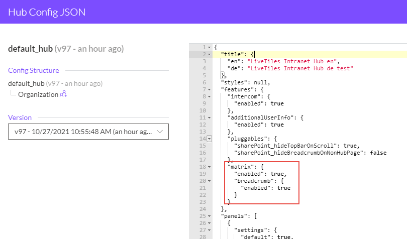
You can also use the Matrix without enabling the breadcrumb. In this case the Mega Menu breadcrumb will be the default if enabled.
Matrix Editor
The Matrix Editor is where administrators can create and edit dimensions, groups, items and assignment relationships for their matrix.
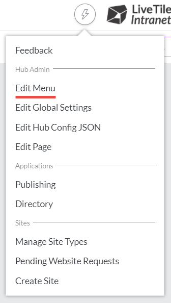
This can be accessed by first clicking the Edit Menu link in the action menu and then the Edit Matrix button displayed above the Mega Menu.

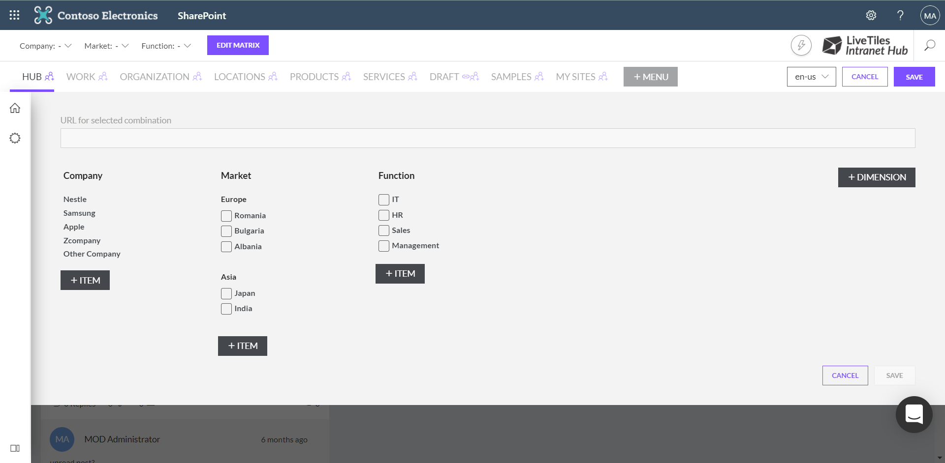
When the editor is active a flyout will appear displaying all the dimensions and their corresponding groups and items (if any exist).
Managing Dimensions, Groups And Items
You can create dimensions, groups and items by clicking on the associated buttons in the editor flyout.
Note: The filter keys are an optional field that will be made consumable through other web parts at a later stage.
Hovering over an item will also display editing and deleting icons.
Creating the above elements however is not enough for the Matrix Navigation to display. Assignments must be created which we will go over in the next section.
Note: Groups and items cannot be converted to another type once created.
Making Assignments
The first dimension on the left-hand side is the root dimension which contains a collection of root nodes. In order to begin creating a new assignment path, a root node must be selected first.
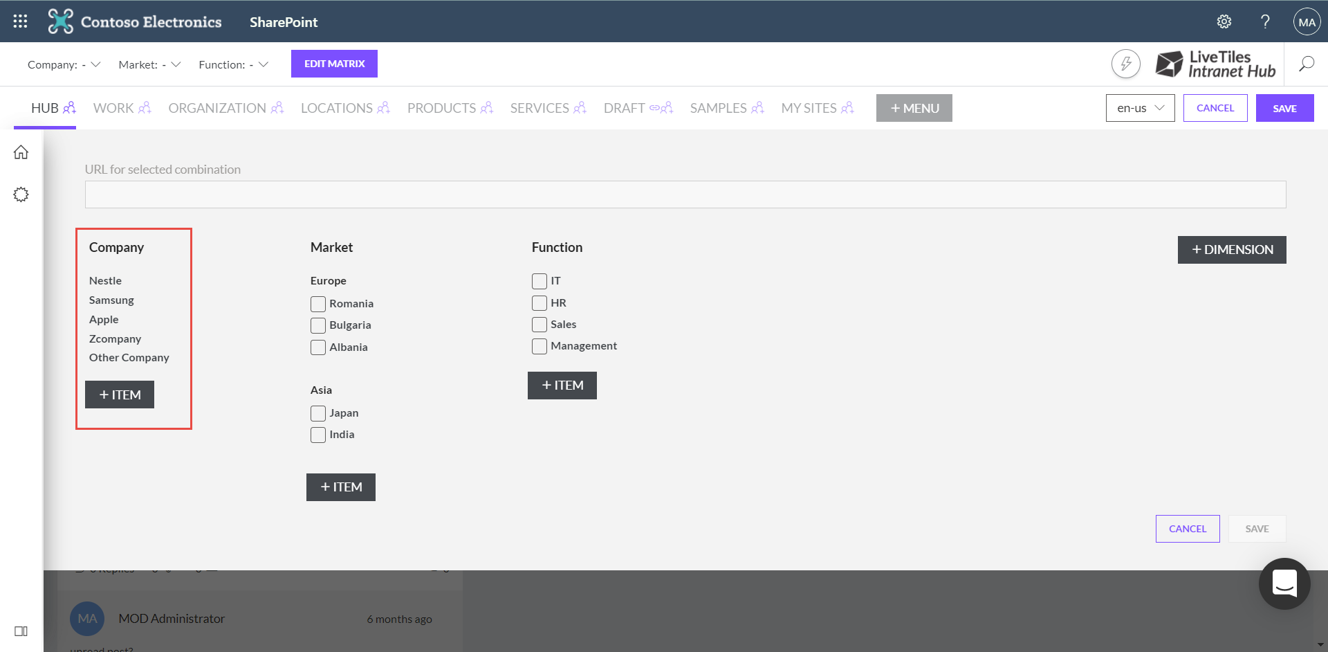
Once a root node is highlighted you can continue making an assignment by selecting one of the following dimension items.
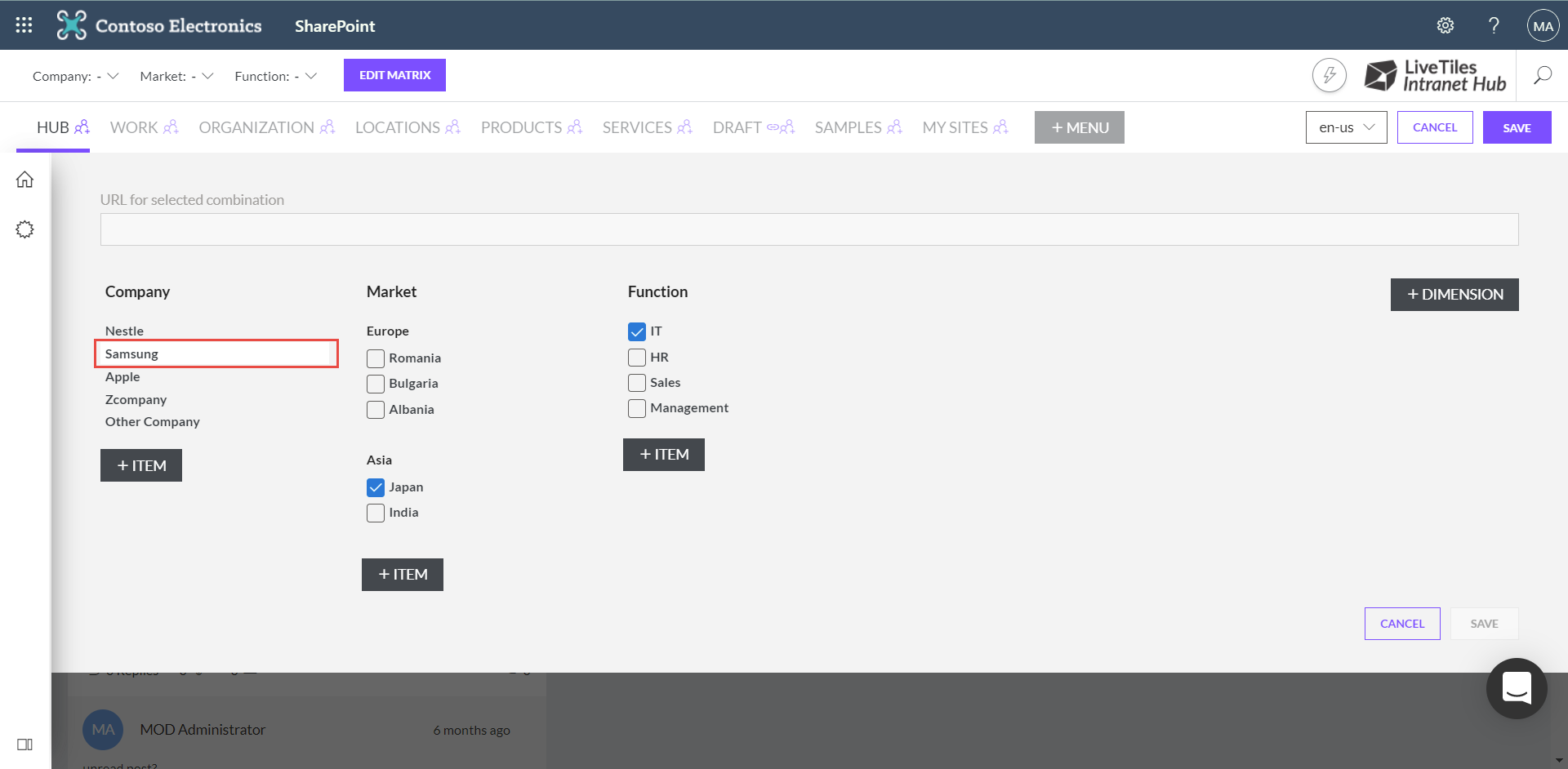
As you make your way across the matrix selecting items to add to an assignment you will notice some items will display as checked or unchecked. This is related to other assignments that have been made which have a similar path that you are currently creating.
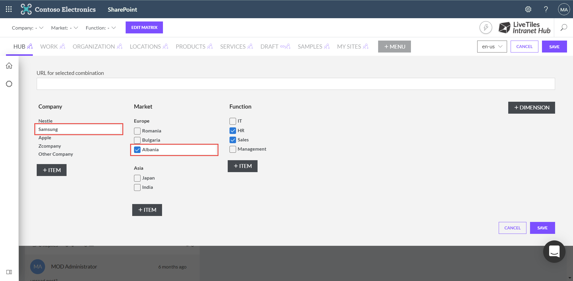
Assignment paths can also have a URL specified which will open a new tab when the last item in that path is clicked.
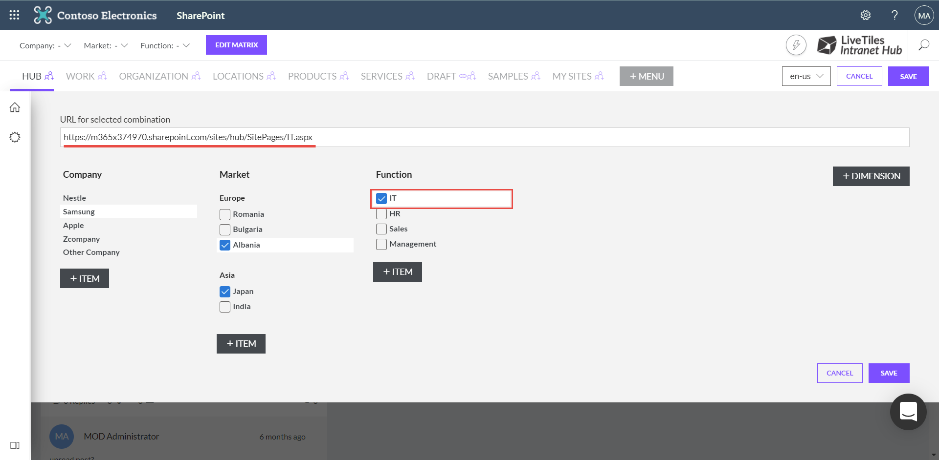
Editing or deleting a path assignment can be done by first selecting the assignment in the editor from left to right starting with a root node and subsequentially de-selecting from right to left in order to remove that assignment.
Note: You must click the Save button located in the bottom right of the editor flyout or any amendments to your matrix will be discarded.
Matrix Navigation
The Matrix Navigation is displayed above the Mega Menu.
Note: If there are no assignments saved, no navigation items will be available.
Making selections from left to right will display any assignment items in the next dimension.


Assignment paths can either be a continuous or non-continuous selection. Meaning you could skip a dimension resulting in the below example selection.
Other Company > None > HR
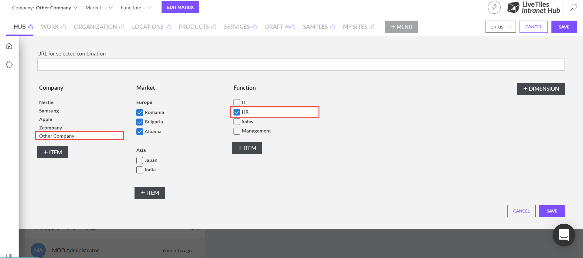
The None option will display in the Matrix Navigation if one exists for that root node.
Display Matrix Dimensions in the Mega Menu
You can assign Matrix Dimensions to display alongside Mega Menu items. To enable this behaviour check the "Display in MegaMenu" option while editing a dimension.

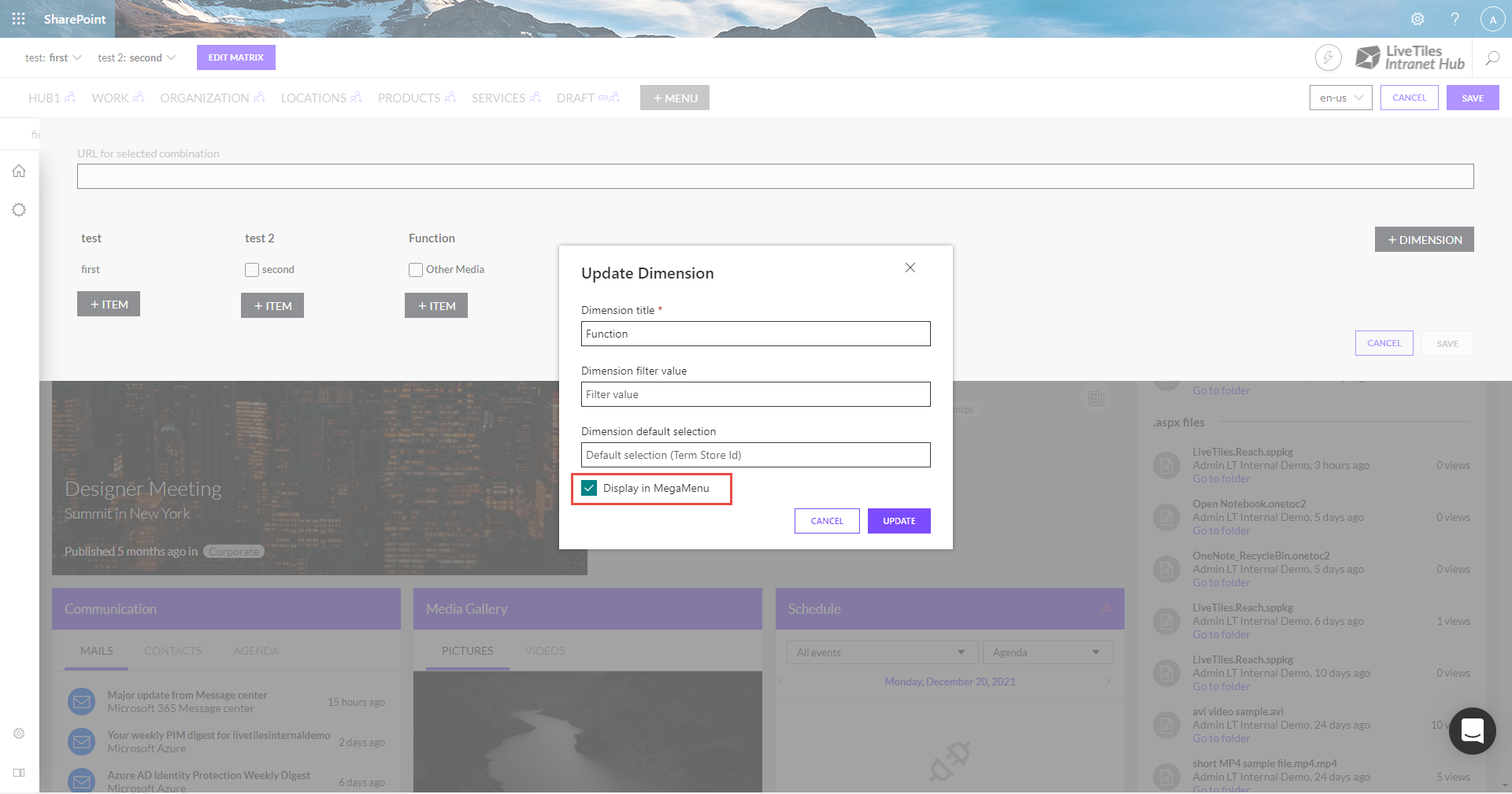


Matrix Dimension items will always display as the first item in the Mega Menu unless the first item is set to display an icon.
Hide None Dimension Breadcrumb Labels
When the Matrix Breadcrumb is enabled, by default when a dimension assignment is set to the "None" option this will appear in the breadcrumb as below:
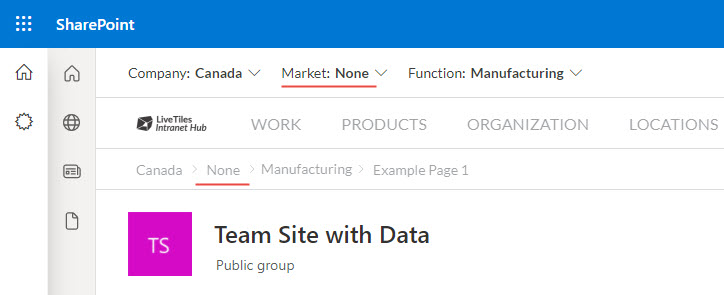
This can be hidden using the displayUnlabeledItems feature flag:
"features": {
    ...
    "matrix": {
      ...
      "breadcrumb": {
        "enabled": true,
        "displayUnlabeledItems": false
      }
    }
  }

Load Selections Based On URL
The Matrix selectors can also be updated automatically based on the current page's URL. To enable this feature the below flag must be added to the features > matrix object in the Global Hub Config.
"features": {
    ...
    "matrix": {
      ...
      "loadSelectionByURL": {
        "enabled": true
      }
    }
  }
This will update the Matrix selection path based on the URL assigned to it.

Prefix-based URL selection loading
By default, the loadSelectionByUrl feature only looks for assignments that match the exact URL of the page. We can enable the useURLAsPrefix feature in order to have the Matrix recognize URLs that are localized under a specific assignment's designated URL.
To enable this feature, we need to set the useURLAsPrefix property to true under loadSelectionByURL in the Global Hub Config.
  "loadSelectionByURL": {
    "enabled": true,
    "useURLAsPrefix": true
  }
As an example, let's say that we have two Matrix assignments, one mapped to /sites/finances-de and one to /sites/finances-en. Enabling this feature will allow the Matrix to automatically select the /sites/finances-de assignment if we're loading a page under that specific site collection ( ex. /sites/finances-de/SitePages/Home.aspx ), and automatically switch to /sites/finances-en if we go to a page under that site collection.
The Breadcrumb is also updated with the same values as the Matrix selectors.
URL Target
Anchor link targets can also be specified by setting urlTarget within the Matrix object under the features section of the Hub Config.
Note: This property is optional and will default to "_self" if not set.
"features": {
    ...
    "matrix": {
      ...
      "urlTarget": "_blank"
    }
  }
In the above example all links clicked inside the Matrix Breadcrumb or a Matrix Dimension will open the specified URL in a new window.
For more information on anchor element targeting click here.
Preselection Filtering
By default the Matrix Navigation selectors will all display regardless if a dimension is set to a "None" item.

By enabling the preselection feature these selectors will only display if it has items available that do not contain a "None" item or if an item is currently selected within the dimension.

To enable this feature add the below preselection property to the matrix features hub config.
"features": {
    ...
    "matrix": {
      ...
      "preselection": {
        "enabled": true
      }
    }
  }
Hide The Reset Dimension Link
By default the flyout for the root dimension will provide the user with a reset link. When clicked this will reset/clear the current users selection path.
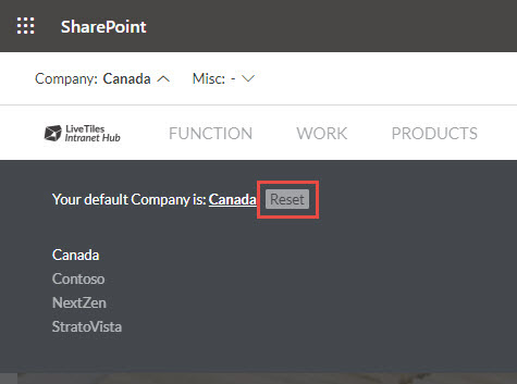
This can be hidden by applying the below feature flag to the matrix config.
"features": {
    ...
    "matrix": {
      ...
      "resetRootDimensionLink": {
        "display": false
      }
    }
  }
Matrix Custom Styling
Elements of the matrix menu source is populated with classes that can be targeted via custom CSS. These classes are all prefixed with lthub-.
A number of CSS variables have been defined for some of the more commonly changes styling values. These CSS variables are as follows and can be re-defined in any custom CSS using the :root pseudo class.
:root {
  --matrix-base-font-size: 1rem; // Base font size
  --matrix-dimension-color: inherit; // Dimension selector color
  --matrix-flyout-background: #000; // Flyout background
  --matrix-flyout-text-color: #fff; // Flyout base color
  --matrix-flyout-padding: 2rem; // Flyout container padding
  --matrix-flyout-column-width: 200px; // Flyout column width
  --matrix-flyout-items-per-column: 4; // Flyout number of rows per column
}
Colour variables can be re-defined to match colours set in the Hub Global Settings -> Adjust Theme panel.
// Accent: var(--brand-accent)
// Neutral: var(--brand-neutral)
// Primary: var(--brand-primary)
// Secondary: var(--brand-secondary)

:root {
  --matrix-flyout-background: var(--brand-accent);
}
Variables can be scoped to an item group within the matrix menu by targeting the class of the container for that group. This class is the group ID prefixed by groupid-.
// Where 'europe' is the group ID, displaying 6 items per column for just that group

.groupid-europe {
  --matrix-flyout-items-per-column: 6;
}
For details on applying custom CSS to Hub please take a look at Custom Styling
Matrix Translations
Elements of the matrix can now be translated. This is done by using the language selector that appears in the Editing Mode of the menu.
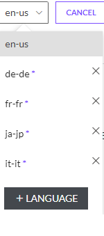
The translation of an element is done in this way:
- Select a language from the
Language Selector - Click the
Edit Matrixbutton - Click on the
Editbutton of the Matrix Element that you want to translate
After clicking the Edit button, the person with menu editing permissions / the Intranet Hub Admin will be able to edit the item label of the element.
The label / title value will contain the translation for that element in the selected language.
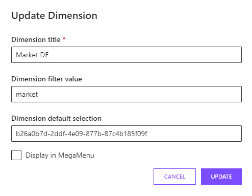
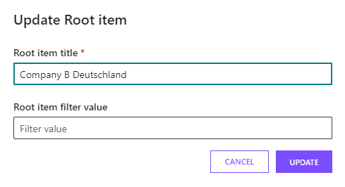
After translating the required elements, the person with menu editing permissions / the Intranet Hub Admin could save these changes by clicking the save button.

The Intranet Hub Product is able to detect the user's preferred language and display the correct translation for the Matrix Elements.


