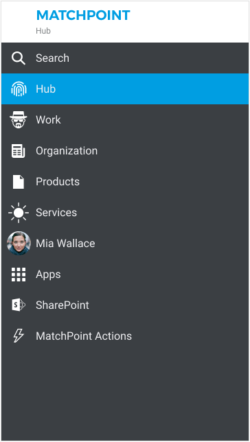
Navigation
Overview
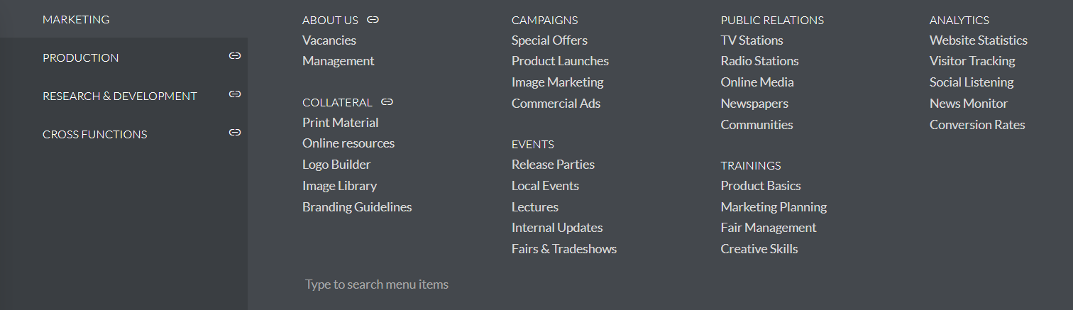
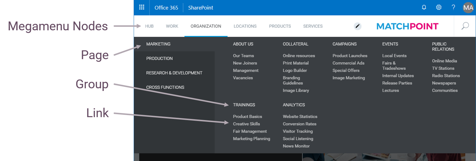
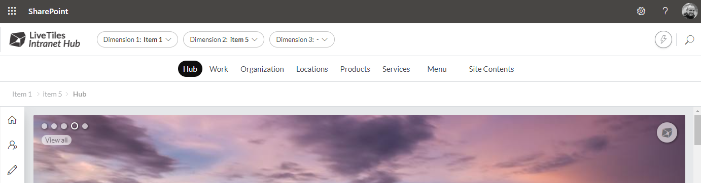
LiveTiles Intranet Hub provides a well organized navigation, which helpes the user to access the desired places quickly and prevents them to get lost in Microsoft 365. The navigation is located in the header and consists of top navigation nodes with each having its own mega flyout associated.
Overall Availability
The navigation of LiveTiles Intranet Hub can be integrated all over in SharePoint Online tenant. You can achieve that by adding the LiveTiles Intranet Hub app to the sites, where the navigation should be integrated.
Structure
Each mega flyout of a top node is structered in to the following hierarchical levels:
- Page
- Group
- Link
Inline Editor
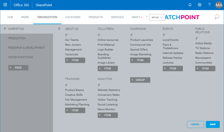
The configuration of the megamenu can be done via a comfortable inline configuration editor.
In this editor you can define new nodes and the elements of the mega flyout.
Elements of the menu can be arranged via drag and drop.
Editor can be accessed via the action menu(lightning menu) by clicking on Edit Menu.
Note: Parent node will be shown only if it contains items under it.
Multi-language Support
All the texts of the elements in the megamenu can be defined in mulitple languages. You can even define separate URLs for the links in case the links point to different pages for each language.
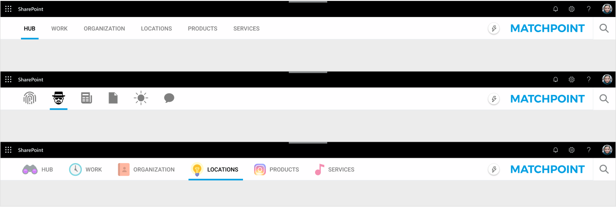
Top Navigation Nodes Icons
The top navigation nodes can be rendered in different ways depending on the device you access the application with. On desktop you can choose between displaying only text, an icon or both text and icon while on mobile you have the choice of rendering either only text or text and icon.
The configuration is done on a per-node basis within each node's style property. On the iconUrl property you can specify the URL of the icon. If this is omitted, only the node title will be rendered.
The render mode can be specified on the renderMode property for both mobile and web on the corresponding sub-properties, mobile and web respectively. The accepted values for render modes can be found by looking up the enums MobileMegaMenuRootNodeTitleRenderMode and WebMegaMenuRootNodeTitleRenderMode in the reference documentation.
A guide to specifying the render mode:
- in order to render the text only you only need to specify the value
texton therenderModeproperty. You don't need to specify anything for theiconUrlproperty. - in order to render the text and icons you need to specify the value
textandiconon therenderModeproperty together with the URL of the icon on theiconUrlproperty. - in order to render the icon only you need to specify the value
iconon therenderModeproperty together with the URL of the icon on theiconUrlproperty. This render mode is not available on mobile.
Desktop rendering options example:
Mobile text and icon rendering option example:
Hyperlink Interception
By default on a modern page in SharePoint when a hyperlink is clicked, navigation to the page is achieved via a page router to avoid full refresh of the screen. Click here for more information
You can control weather the page will make a full refresh from a link clicked inside the menu by setting an optional feature flag in your Hub Config.
"features": {
    ...
    "megaMenu": {
      "dataInterception": "off"
    }
  }
Note: This
dataInterceptionproperty is by default "on"
Modern Style
To implement a modern style to the header/navigation area, set a style string value to modern in the header object of your config.
  "header": {
    "style": "modern",
    ...
  }
Top Navigation Nodes Styling
Top navigation nodes can be styled with custom colors for the background and the text. This can be done via the global config by specifying the desired color combination for each root node under the style optional property.
For defining the colour of an active megamenu child item, add this configuration inside the styles node from the Hub JSON Config Editor:
Before applying the JSON configuration, the active elements will have a default color such as this:

     "colors": {
      "component": {
        "header": {
          "megaMenu": {
            "highLightText": "HEX CODE for desired colour"
          }
        }
      }
    }
After applying the JSON configuration, the active elements will look like this:

The configuration used for this example is this:
     "styles": {
    "colors": {
      "component": {
        "header": {
          "megaMenu": {
            "highLightText": "#FF00E8"
          }
        }
      }
    }
  }
Masonry Style Layout
By default, groups of menu items in the Megamenu flyout is displayed in a grid style layout. In certain instances this can result in whitespace between the groups depending on the number of items in each group. To remove this whitespace you can enable a masonry style layout with the following configuration.
"header": {
  "megaMenuSettings": {
    "flyoutMasonryLayout": true
  }
}